
Technical analysis is the study of past price action to reliably forecast future prices. By studying how price and volume behaved in similar market conditions in the past, technical traders rely solely on this information to find an edge and try to predict how the market may play out in the future.
Since technical analysis is a very wide-ranging field, this article only serves to give the reader a solid introduction to some of the most effective technical analysis techniques. Subscribe to our blog for more trading-related content, as we’ll go into depth into some strategies outlined here!
Purely technical traders do not care about fundamentals or sentiment, focusing solely on price action and indicators derived from the price or trading volume. Although technical analysis often gets a bad rap, it can be useful for investors and traders: the key is knowing what the indicators represent, how they are calculated, their likelihood of success and executing trades using these methods accordingly.
Need an introduction to the topic of price action? Check out our team brown bag video, the 1-2-3’s of price action, to learn more.
The foundations for technical analysis were laid with candlestick analysis from 18th century Japan and Dow theory, which became popular in the 1920s/1930s and posits that the price of company stocks moves in waves. With the increasing financialization of the global economy from the 1980s onwards, the field of technical analysis has blossomed and become a popular way for traders to navigate the markets.
There are five broad elements that technical analysts consider, all of which are explained in the following sections:
-
Chart types
-
Determining the trend
-
Gauging momentum
-
Evaluating volatility
-
Identifying chart patterns
1. Chart Types
“Before I enter a trade, I set stops at a point which the chart sour” - Ed Seykota
As the quote above suggests, charts provide a map to the markets. Technical traders should be able to read the chart to pinpoint exactly where they will go long or short, where they will exit the trade at a loss, and where they will exit the trade with a profit.
There are many different types of charts, but we briefly cover four that are the simplest and most popular types: candlestick, heikin ashi, point and figure, and renko.
Candlestick Charts
The most commonly used charts are candlestick charts, which provide a lot of information in the form of Open-High-Low-Close (OHLC) as well as bullish, bearish or neutral patterns that show whether buyers, sellers, or neither, are in control.
Learn how to use candlestick charts here:
Heikin Ashi Charts
Heikin Ashi charts are very similar to candlestick charts, but with one major difference: they filter out some of the price action by modifying the OHLC. For example, the closing price on a Heikin Ashi chart is the average of the current candlestick’s OHLC, and the opening price is the midpoint of the previous candlestick.
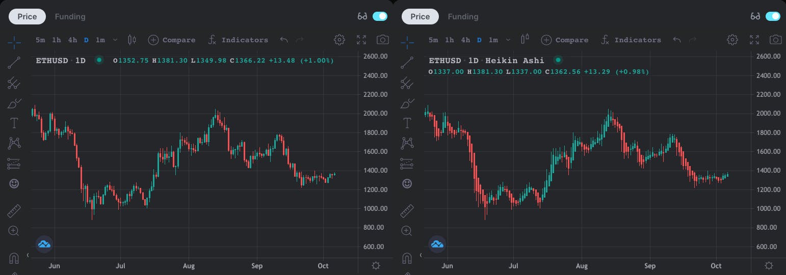
Like candlestick charts, Heikin Ashi charts originated in Japan and the term actually translates to ‘average bar’.
Since it’s taking an average of the price movements, trends become easier to identify, as the candle’s color tends to stay green (or red) when the price is in an uptrend (or downtrend). In contrast, the colors on a candlestick chart can change frequently, even if there is a strong trend in a certain direction.
Another advantage of Heikin Ashi charts over candles: there are far fewer signals to remember! While there are dozens of different candlestick patterns, only Dojis and their variations are found in Heikin Ashi charts.
The main things to look out for are:
-
Heikin Ashi candles with no lower or upper wick mean there is a strong trend. For example, if you’re long ETH-USD, keep the position open as long as the Heikin Ashi chart shows green candles with no lower wicks. If you’re short, then you’d want to see no upper wicks for the duration of your trade to confirm a strong downtrend is in play.
-
The Doji pattern is often found on Heikin Ashi charts, which indicates indecision and that a change in trend has a greater likelihood of occurring.
Point and Figure Charts
A popular method which used to be drawn out by hand by investors and traders and abstracts from the concept of time. Instead of showing the OHLC like candlestick charts, Point and Figure (P&F) charts stack X’s or O’s according to a set price movement, known as the box amount, which is usually based on the Average True Range.
For example, when the price falls by a certain amount, it will be represented on the chart by an X. While if the price rises by a predetermined amount, it’s shown on the chart as an O. These charts help analysts find clear breakouts, trendlines, as well as levels of support and resistance, removing much of the noise found in candlestick charts.
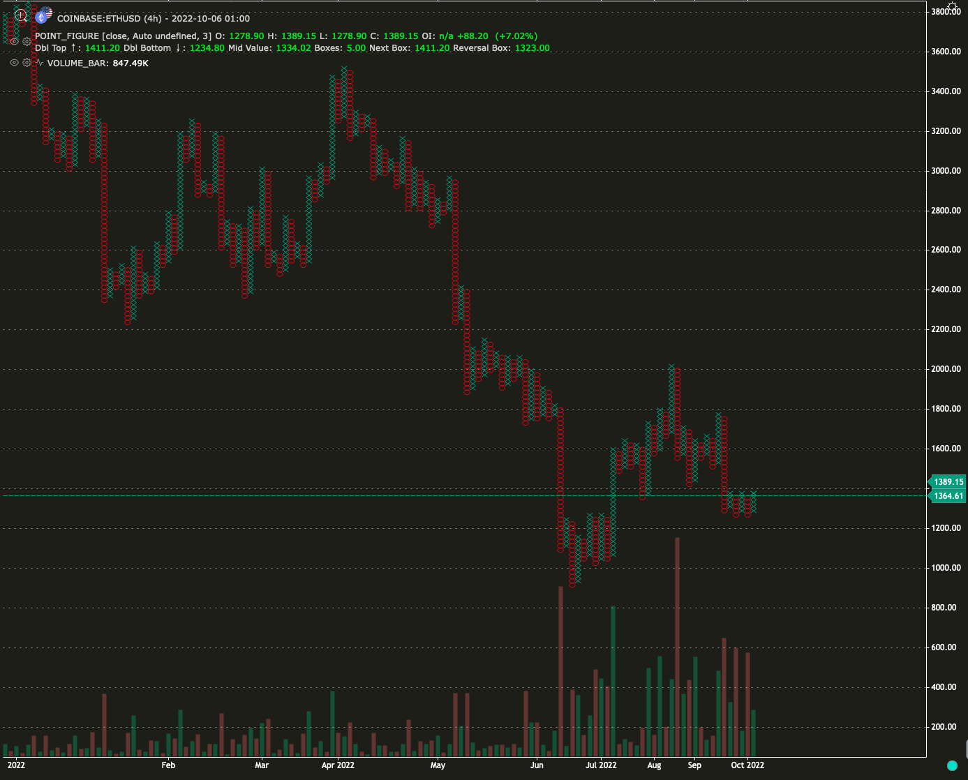
Source: GoCharting
Renko Charts
Renko charts are similar to P&F charts in that they abstract from time and a brick is painted on the chart if the price moves a certain amount. Some other similarities with P&F charts include: both use the average true range to determine the price movement to paint a new brick and both chart types clearly highlight levels of support and resistance.
Removing all the noise from candlestick charts, Renko charts provide a very simple interpretation. A buy signal is given once a green brick forms after a series of red bricks and a sell signal is given once a red brick is painted on the chart after a series of green bricks.
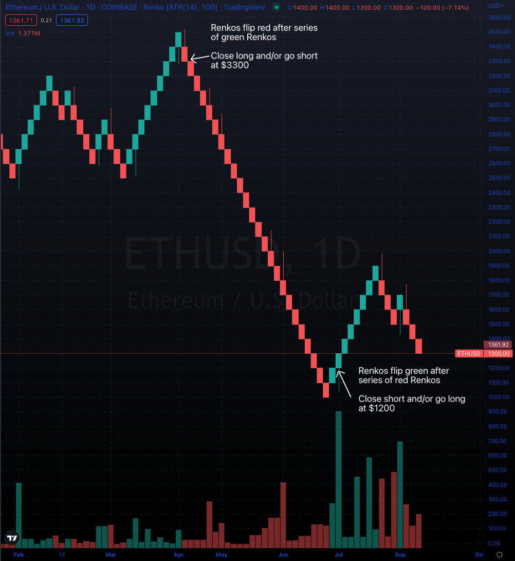
Source: TradingView
As shown above, the use of Renkos can help a trader find potential entry and exit points. Also, removing of the time element from the chart encourages the trader to be more patient.
However, using this technique isn’t always guaranteed to deliver favorable outcomes as there can sometimes be fakeouts, such as in February 2022, where there was just one green Renko then a continuation of red Renkos. But combining these charts with volume indicators and only acting on reversal signals that have high volume can help to filter out any potential fakeouts.
2. Determining the Trend
“The trend is your friend, except at the end when it bends” - Ed Seykota
One way to determine the trend is to use moving averages (MAs), which smooth out fluctuations in the market price. As a general rule, whenever the price moves up and above a MA after trending below it, this suggests it may be the start of a bullish trend. On the other hand, if the price falls below a MA after trading above it, then it could suggest the start of a bearish trend.
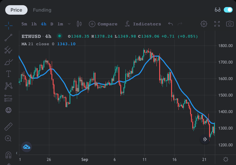
An example is shown above for ETH-USD with the 21-period MA on the 4-hour chart.
Notice that when the price closes above the MA, the price action tends to become bullish with the MA providing support. You’ll often see the price break above the MA, then retest the MA as support. We can also see that the price tends to decline after closing below the MA, often re-testing the MA as resistance.
There are two types of MAs you should be familiar with:
-
Simple moving averages (SMA) take the average of the market price over a certain period, for example 200 days gives you the 200-day SMA.
-
Exponential moving averages (EMA) differ from SMAs in that more weight is placed on more recent price action. For EMAs with shorter periods, greater weight is applied to the most recent price.
Because of the difference in calculating SMAs and EMAs, the EMA is quicker to react to price changes while the SMA takes more time. Therefore, the EMA may be prone to fake breakouts and false signals, but the upside is that it will provide signals before the SMA does.
Fibonacci numbers are often used to represent short-term, medium-term and long-term trends, e.g., the 21-period MA for short-term trends, the 55-period MA for medium-term trends, and the 144-period MA for long-term trends.
Some other widely used MAs are the 50-period, 100-period and 200-period variants, but it is down to the trader to backtest different configurations, find the optimal length to generate reliable trading signals based on their trading style. For example, swing traders may use MAs that are calculated over longer time periods on the 4-hour chart, while scalpers may use MAs that are calculated over very short durations on the 5-minute chart.
Multiple MAs can be combined as well to provide trading signals, known as crossovers. For example, the golden cross is a famous signal derived from MAs where a short-term MA crosses above a longer-term MA, e.g., the 50-day MA crosses above the 200-day MA. The opposite of a golden cross is a death cross, which refers to the situation where a short-term MA crossed below a longer-term one.
Some weaknesses of MAs are worth keeping in mind: they are lagging indicators and do not work well when the price is ranging, i.e., in a crab market. Trading with MAs works best when the price is trending.
Volume is another important factor when analyzing price trends. As the saying goes, “volume precedes price”, so in any trend, we want to see rising volume over time for it to remain intact. If there’s a sudden drop in volume, then this tells us that traders are becoming less and less interested in the current move and it might reverse. As well as the volume indicator itself, there are variations, such as delta volume, cumulative volume delta and more.
3. Gauging Momentum
“Buy things that are going up. Sell things that are going down. And when they stop, get out!” Rob Smith
Once the trend has been identified, the next step is to gauge momentum, which refers to the speed of the price trend. Oscillators like the Average Directional Index (ADX), the Awesome Oscillator (AO), MACD, and Relative Strength Index (RSI) measure the rate of change in a trend, telling us if it is speeding up or slowing down.
Traders should aim to go with the flow of the prevailing trend when it is gaining momentum and accelerating, while they should exit the position once the speed of the price trend starts settling down. When oscillators reach an extreme high, then it suggests the market is experiencing overbought conditions, and the uptrend is faltering. On the other hand, when oscillators reach an extreme low, then it indicates that the market is oversold, and the downtrend is faltering.
An example is shown below with the RSI. Extreme lows in momentum are indicated when the RSI is below 30, while extreme highs are associated with values above 70.
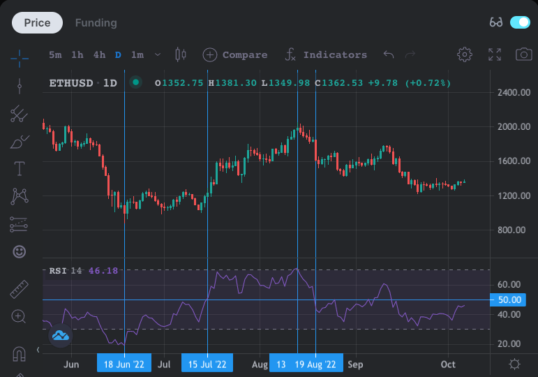
We can see from the chart that ETH-USD bottomed on June 18th when the RSI indicated oversold conditions and the price went on to rise over the following two months. Another important thing to note is that when the RSI crosses above or below 50, then it suggests that the uptrend or downtrend is gaining momentum. This is clearly shown on the chart on July 15th, and the uptrend accelerated.
However, by August 13th, the RSI indicated overbought conditions reaching an extreme high above 70 and marked the top of the uptrend. Six days later, the RSI declined below 50, which suggested an acceleration of the downward trend and ETH-USD eventually hit lows near $1,200.
It’s also important to keep in mind that markets can remain in overbought or oversold conditions for extended periods of time (as in mid-June on the chart above). Trend and momentum is just one factor to consider in technical analysis, where other variables like volatility and chart patterns also play an important role.
4. Evaluating Volatility
“Short term volatility is greatest at turning points and diminishes as a trend becomes established” - George Soros
Volatility is defined as the degree to which the price fluctuates over time. Traders can make a living by virtue of volatile price movements and by monitoring volatility, it can help you know when to stay out of the markets (i.e., when volatility is declining/low) and when to enter the market (i.e., after a long period of low volatility).
While price is not very predictable, volatility is, since there are cycles of high volatility, then low volatility, eventually returning to volatile conditions. So if you think of volatility as a never-ending cycle, then it can help you a lot with your trading.
Two popular techniques that are used to evaluate price volatility are the Average True Range (ATR) and the Bollinger Bands.
Average True Range
The ATR basically tells us the average price move over a defined period. The standard setting is 14 periods, but this can be adjusted to any number you want. This measure of volatility is useful since it can bring your expectations in line with reality.
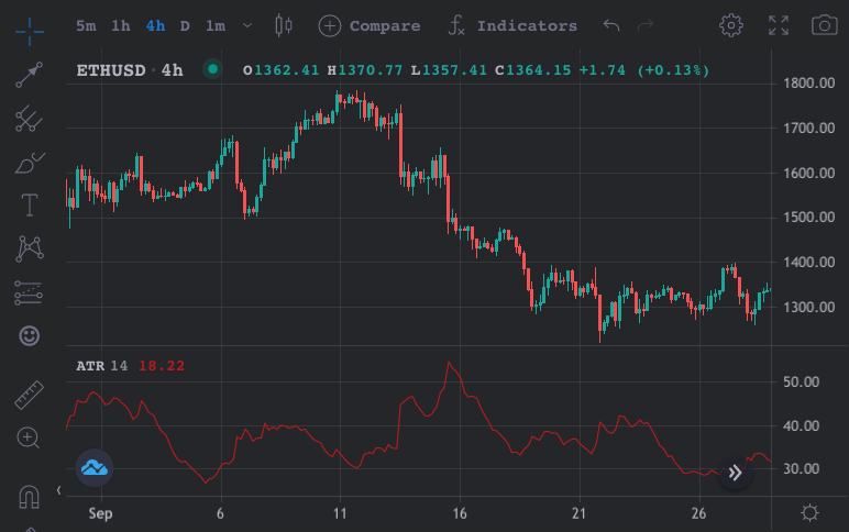
Are you going long expecting a 10% price increase? You can check whether that’s reasonable by paying close attention to the ATR. Ask yourself, has the recent price action been volatile enough to justify your profit target? Are your stops too close to your entry based on the ATR? These are important considerations before entering a position.
Bollinger Bands
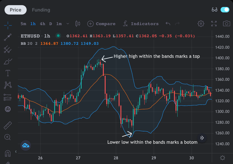
Bollinger bands, invented by John Bollinger in the 1980s, are a popular trading tool that helps to visualize volatility, with three lines. The upper band shows the average price over 20 periods plus two standard deviations. The middle band shows the average price over 20 periods, while the lower band shows the average price minus two standard deviations.
The price of an asset will spend most of its time in the bands and revert to the mean over time (i.e., the middle band). But the width of the bands indicates how volatile the market is and the relative position of price compared to bands can help traders to spot bottoms and tops in the market.
For example, when the price rises above the upper band, this is usually a sign that the market is overheated while when the price dips below the lower band, then it is usually indicative that the market is close to bottoming out.
Also, if the price continues higher but this new high is within the bands as opposed to outside the bands, then it suggests a top is forming. Similarly, if the price makes a low beneath the lower band and continues lower, but the new low is within the bands, then it usually marks a bottom.
As well as the bands themselves, the Bollinger Band width indicator visualizes the width of the bands, which is effectively price volatility. As mentioned earlier, volatility is predictable since it moves in a constant cycle of low volatility to high volatility to low volatility, and so on.
Therefore, one technique is to look for historically low bandwidth values, as volatility will return to the market at some point. While it doesn’t tell you the direction in which the price breakout will occur, you can use other techniques to determine whether to go long or short when you notice a very low band width value.
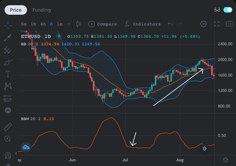
For example, the chart above shows that in early July, the band width reached the lowest value in just under one month, suggesting a breakout was imminent. As volatility returned and the band width trended higher, the price of ETH advanced upwards as well.
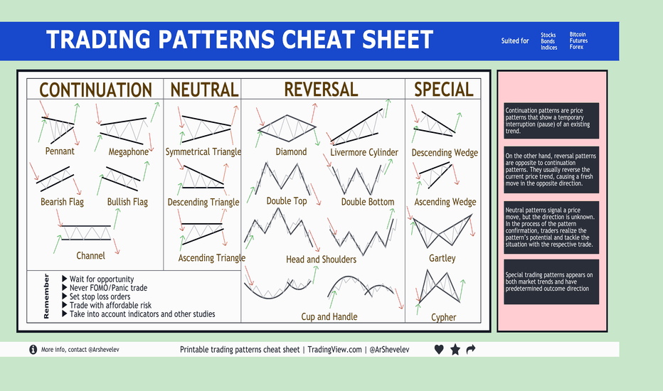
5. Identifying Patterns
“Patterns don’t work 100% of the time. But they are still critical because they help you define your risk. If you ignore patterns and focus on hunches, feelings, and hot tips, just forget about achieving consistency” - Ifan Wei
Chart Patterns
Chart patterns are a tried and tested technique in the financial markets, with various patterns highlighting trend continuations or reversals.
For example, some well-known ones are the double bottom/double top, head and shoulders, flags, wedges and pennants, with certain identifying characteristics for each pattern. These patterns can help to identify breakouts, inform the best areas to place your stop loss as well as where to take profits.
Source: TradingView
As well as simple chart patterns, there are also harmonic chart patterns which are a bit more complicated, utilizing Fibonacci retracements and extensions to provide potential setups.
Unlike the other tools mentioned previously, chart patterns have to be identified and drawn on the chart yourself. While we won’t provide a full rundown of how to use each of these simple or harmonic patterns here (maybe we’ll save it for a future article!), it is worth learning more about them to help you improve your technical analysis.
Elliott Waves
Elliott wave theory is a form of technical analysis that’s popular amongst traders, which uncovers recurrent long-term patterns, similar to Dow theory in that the price of stocks move in waves. While overwhelming at first, taking the time to learn about Elliott wave patterns is worthwhile if you’re serious about investing or trading.
Despite being developed in the 1930s, the creator Ralph Nelson Elliott was way ahead of his time, recognizing the chaotic and fractal nature of markets decades before scientists such as Benoit Mandelbrot came up with chaos theory and demonstrated fractals mathematically.
The basic overview of Elliott wave theory is that the prices of stock were structured in the same way: five impulsive waves in the trend’s direction, followed by three corrective waves in the opposite direction.
By using Elliot waves as a guide, analysts can determine what wave the market is currently in and make predictions about future market moves before they unfold. Also, due to the fractal nature of markets, there are waves within waves, with the 5-3 patterns repeating itself infinitely over smaller timeframes.
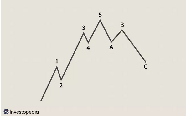
Source: Investopedia
The five impulsive waves move in the direction of the main trend, followed by three corrective waves, as shown above for an upward trend. While the underlying patterns remain the same, the timing of each wave may differ.
While there are many more important details, we’ll leave a full explanation of Elliot waves for another article!
Pros and Cons of Technical Analysis
“Beginners focus on analysis, but professionals operate in a three dimensional space. They are aware of trading psychology, their own feelings and the mass psychology of the markets” - Alexander Elder
Now that we’ve covered the main elements of technical analysis, let’s discuss some pros and cons of this approach.
Pros
-
Since technical analysis is only concerned with price action, it can help traders to remain objective. Fundamental and sentiment analysis can often be subject to bias.
-
Technical indicators are derived mathematically from the price of an asset and these metrics benefit traders with a structured approach. The difficult part is determining your own set of rules to take a trade and sticking to it, but a methodical approach using technical indicators is much better than trading off emotion or hunches. It’s advised to have a deep understanding of how the various indicators are derived and understand the principles behind them before just blindly trading the signals.
-
An experienced and skilled technical trader can quickly gain a lot of information from looking at a chart and plan their trade, identifying trends, momentum, volatility and patterns to guide their decisions. This information is also more widely accessible than high-quality fundamental or sentiment data.
Cons
-
Technical analysis is more of an art than it is a science. As a result, you may encounter fake signals that suggest going long or short, but end up not working out. Therefore, traders should take a probabilistic mindset, implement proper risk management practices, and hone their strategies before trading with real money. There’s also ‘analysis paralysis’, where looking at a variety of indicators and different timeframes makes it difficult to come to a conclusion and make a decision.
-
While they often rhyme, the past can not always predict the future. That means certain techniques or technical strategies that work well for some time may not continue to work well in the future. Backtesting, although a useful practice, only considers market conditions in the past. The market conditions are always in flux, so this should be accounted for too.
-
The disregard for fundamentals or sentiment means that technical traders may get caught blindsided when there’s some important news that moves the market. Fundamental analysis actually attempts to put a value on an asset, something technicals can’t do. In reality, hardly any traders use just one approach, but put most of their focus on either technicals, fundamentals or sentiment, so you should try to incorporate these other analytical techniques into your trading style.